Shooting cars = reflectionsAll Japan Day in Adelaide, from yesterday. This one probably turned out the best, despite not being very good. Think I over-processed the clouds a little, or didn't spend enough time masking out the skyline (as in the line of the sky) properly.
Any tips for editing/shooting cars? Really hard to make any car photos interesting, especially when they're parked on the grass surrounded by hundreds of others and it's overcast.
And Craig, amazing shot as per usual.
EDIT: Whoah image size batman!!! Gotta run for uni, no time to resize now.
The Photo Snob Thread
- Thread starter brisneyland
- Start date
._._._._._.
Likes Dirt
I know I really really really need a polarizing filter, I was fretting out the days beforehand since I thought it'd be way sunnier, but the overcast-ness made it a little easier for me. I'd also love some flash rigs so I can do a pretty cool car shoot at nice locations and have it lit how I want, rather than luck and gross orange street lights.Your best friend when shooting cars is a polarizing filter. Makes the world of difference when cutting reflections and the likes")
Problem is I have a shitty rusty 240z that's going through a ground up build, and a less shitty S13 that loves having my money spent on it hahah. Not much left for anything, let alone camera toys.
Appreciate the feedback guys.
AngoXC
Wheel size expert
I swear those Zs came with factory rustI know I really really really need a polarizing filter, I was fretting out the days beforehand since I thought it'd be way sunnier, but the overcast-ness made it a little easier for me. I'd also love some flash rigs so I can do a pretty cool car shoot at nice locations and have it lit how I want, rather than luck and gross orange street lights.
Problem is I have a shitty rusty 240z that's going through a ground up build, and a less shitty S13 that loves having my money spent on it hahah. Not much left for anything, let alone camera toys.
Appreciate the feedback guys.
For night shots, all you need is one flash. Alternatively, an eBay soft box and a LED torch can do wonders also, especially on the cheap. In each case, a combination of a long exposure and careful illumination can give some great results.
Good luck!
WolfCreekPsycho
Likes Dirt
A couple of kids from a friends wedding.... feedback appreciated.


A cir-pol won't improve shots if they're bad to begin with, and they only help remove a certain amount of reflections at a time (in a hurry I still need two shots rotating the polarizer which I then merge in PS to eliminate most of the reflections). Also remember that it'll cut light, so if shooting in lower light you might struggle.All Japan Day in Adelaide, from yesterday. This one probably turned out the best, despite not being very good. Think I over-processed the clouds a little, or didn't spend enough time masking out the skyline (as in the line of the sky) properly.
Any tips for editing/shooting cars? Really hard to make any car photos interesting, especially when they're parked on the grass surrounded by hundreds of others and it's overcast.
And Craig, amazing shot as per usual.
EDIT: Whoah image size batman!!! Gotta run for uni, no time to resize now.
The best thing to do is find the cars on their own, or better yet get the owner to move them to a empty location. Isolating the car is key to a clean and striking image. Work your angles at shows to remove clutter from the background, and utilise depth of field to blur inevitable things. A shot head on at grille height of the skyline closely cropped with a out of focus background in my eyes would have more visual impact than the shot you showed.
99% of images you'll see from a show are taken at head-height, getting on the floor or finding a way to take a birds eye view shot will set your image apart. Keeping an eye out for details that others might miss could help too, a creative sticker or a subtle modification shot well could make for a unique image too.
Most of all, keep shooting.
First shot is lovely, but her expression is unfortunately far too sombre. I'd hope for a sense of wonderment, fascination and childish gleefulness, but instead it's almost an adult look of introspection.A couple of kids from a friends wedding.... feedback appreciated.
Second shot does nothing for me, the selective saturation really doesn't work well and the editing process has rendered the kids looking... sickly...
Third shot is a winner, a great moment and great expressions (the little girl needs the same look in the first image...) and editing is almost spot on. I'd like to suggest separating the faces and hair from the wall a bit, they almost appear to blend in.
WolfCreekPsycho
Likes Dirt
Thanks for the input, its definitely appreciated ! I can see what you mean about the first girls face, sadly she was not posed for the pic I just happened to see her staring in wonderment at flowers so grabbed the pic.. be nice to know what she was actually thinking!First shot is lovely, but her expression is unfortunately far too sombre. I'd hope for a sense of wonderment, fascination and childish gleefulness, but instead it's almost an adult look of introspection.
Second shot does nothing for me, the selective saturation really doesn't work well and the editing process has rendered the kids looking... sickly...
Third shot is a winner, a great moment and great expressions (the little girl needs the same look in the first image...) and editing is almost spot on. I'd like to suggest separating the faces and hair from the wall a bit, they almost appear to blend in.
She also had the attention of the paid photographers for a large part of the day..... not surprisingly.
For the two kids I was trying to get just the slightest amount of pink left in the cheeks and lips, but take your point.... it was actually a desaturation of the kids only.. the wall they are against is almost as shot so has that dark pure black and white look... great backdrop !
Just one more... I'm in two minds with this, part of me really likes the feel of it and its innocence... the other part thinks the eyes make her look like a devil child.... again not posed, though she seemed to know when the camera was on her.

Last edited:
I align my thoughts with this option. The eyes spoil it for me. Way too dark. Other than that, pretty good!the other part thinks the eyes make her look like a devil child....
AngoXC
Wheel size expert
Rad tilt-shift time lapse of Carnaval in Rio de Janerio. Check it out. You will enjoy.
Last edited:
saMfish
Likes Dirt
http://hypebeast.com/2012/03/canon-eos-5d-mark-iii-preview/
5d mk3 specs appear to be slowly coming out. 8)
5d mk3 specs appear to be slowly coming out. 8)
AngoXC
Wheel size expert
600EX and (Radio) Speed light Transmitters too.http://hypebeast.com/2012/03/canon-eos-5d-mark-iii-preview/
5d mk3 specs appear to be slowly coming out. 8)
(Scroll down).
brisneyland
Likes Dirt
Just wanted to say... I'm proud of this thread!

Capone
Likes Dirt
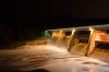
Effort from last night using a D7000 with Nikkor 35mm at f10 20sec
Comments would be appreciated
Comments would be appreciated
Attachments
-
 213.2 KB Views: 242
tre0001
Likes Dirt
long time with no post, starting to get back into photography after a short break.
3 film shots from NSW coast


My new Facebook Group for anyone who is interested.
http://www.facebook.com/pages/Edan-Trevethick-Photography/281953268541602
3 film shots from NSW coast
My new Facebook Group for anyone who is interested.
http://www.facebook.com/pages/Edan-Trevethick-Photography/281953268541602
Effort from last night using a D7000 with Nikkor 35mm at f10 20sec
Comments would be appreciated
Very nice lads! Well done!Been getting pretty bored with this weather in Sydney so I decided to scroll through some old pics on the external hard drive.
I came across this one from May 2011 and decided to try something different.
Thoughts??
**Snip of nice shot**
Craig, I'm really liking the new watermark. Very professional.
long time with no post, starting to get back into photography after a short break.
3 film shots from NSW coast
My new Facebook Group for anyone who is interested.
http://www.facebook.com/pages/Edan-Trevethick-Photography/281953268541602
These. .......
CraigS
Likes Dirt
Cheers, I had a friend (graffic designer) do it for me as I'm useless at these things.Very nice lads! Well done!
Craig, I'm really liking the new watermark. Very professional.
Trying to get in as much practice before I got to NZ in 5 weeks so I don't waste my money.
Macquarie Rivulet at the base of Macquarie Pass this morning.

rabatt
Likes Bikes and Dirt

Urban DH
Likes Bikes and Dirt
hey guys
I'm going to purchase a camera very soon and I know what I would like and I know how much I'm paying and so but I'd just like to gather knowledge and idea on the matter. I'm looking to buy a canon 60d or maybe eve a 7d, they seem to be good value for money and they fulfill all criteria I have and also had a few extras, I wanted a camera with a resonable shutter speed for action shots and so on but also some thing I could leave on a long exposure. It needed to be around the $1000-$1300 range and preferably a canon. I have sourced a 60d at staff price through contacts and it will cost me $1015 direct from canon with an 18mm-200mm lens. I would have preffered a smaller lens for various reasons but also wanted a longer range lens for panaramic shot of mountains and sky and so on. So what are your thought on the matter? here http://www.canon.com.au/For-You/EOS-Digital-SLR-Cameras/60D is link to canon website and the 60d if anyone was after info on it for any reason, and help would be greatly apperciated
I'm going to purchase a camera very soon and I know what I would like and I know how much I'm paying and so but I'd just like to gather knowledge and idea on the matter. I'm looking to buy a canon 60d or maybe eve a 7d, they seem to be good value for money and they fulfill all criteria I have and also had a few extras, I wanted a camera with a resonable shutter speed for action shots and so on but also some thing I could leave on a long exposure. It needed to be around the $1000-$1300 range and preferably a canon. I have sourced a 60d at staff price through contacts and it will cost me $1015 direct from canon with an 18mm-200mm lens. I would have preffered a smaller lens for various reasons but also wanted a longer range lens for panaramic shot of mountains and sky and so on. So what are your thought on the matter? here http://www.canon.com.au/For-You/EOS-Digital-SLR-Cameras/60D is link to canon website and the 60d if anyone was after info on it for any reason, and help would be greatly apperciated